Microsoft Dynamics 365 offers robust functionality for managing and analysing your business data.
Reporting plays a crucial role in gaining insights and making informed decisions. In this guide, we explore various methods for reporting in Dynamics 365 using simple Microsoft tools.
What Can You Do With Reporting In Dynamics 365?
Dynamics 365 allows you to report on any data stored in the Dataverse, Microsoft's common data store for Dynamics 365 and Power Apps. Below are some examples of reports you can easily create:
- Contacts with missing information in their record
- Tasks due in the next week
- Hot opportunities
- Progress against KPIs
- Overall sales pipeline and predicted revenue
- Sources of leads to track marketing efforts
- Invoices due
Methods For Reporting In Dynamics 365
Exporting to Excel
Excel is a familiar tool for many users, making it an excellent starting point for reporting in Dynamics 365. To export data to Excel:
- Navigate to the desired entity (e.g., Leads).
- Choose a relevant view that displays the data you want to report on.
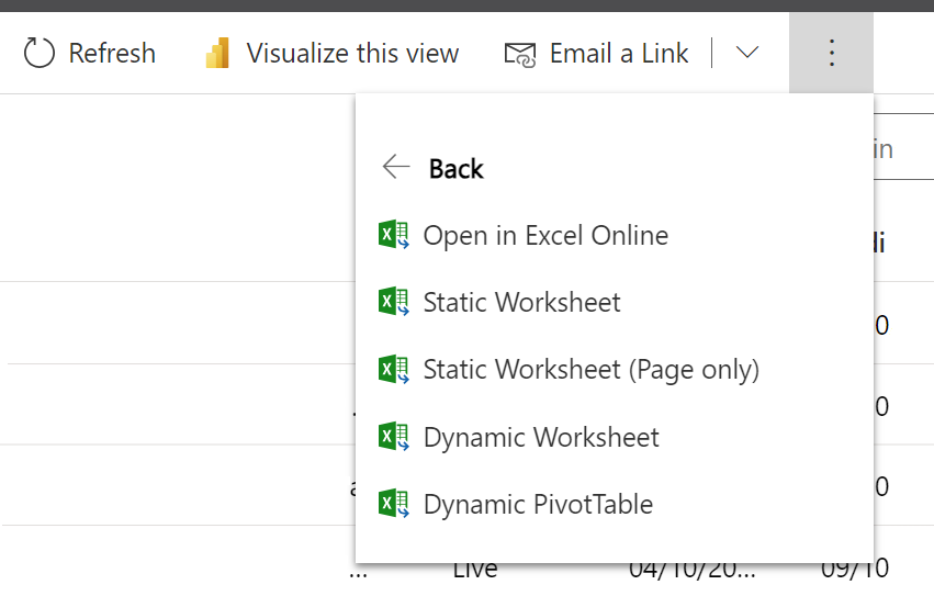
- Click on the "Export to Excel" dropdown and select "Static Worksheet."
Your data is now available in Excel, allowing you to leverage familiar features like charts, grouping, pivot tables, and graphs for detailed analysis. This method is particularly useful for sharing reports with users who may not have direct access to Dynamics 365.

Using Charts, Views, And Dashboards
For regular and repeated reporting in Dynamics 365, you can use built-in tools for creating live-updated reports within the system.
Here's how you can use charts:
- Create a view using Modern Advanced Find, specifying filters based on your reporting criteria.
- Select "Show Chart" and choose a relevant chart type, such as "Leads by Source."
- Customise charts using the chart editor for specific visualisations.
To consolidate multiple charts and data lists, you can create a dashboard:
- Navigate to Dashboards and select "New > Dynamics 365 Dashboard."
- Choose a layout, name your dashboard, and add charts to the dashboard components.
This method offers a more dynamic and interactive way to view and manage multiple reports directly within Dynamics 365.
Benefits Of Visualising Your Data With Charts
Reporting as a whole is used to gain an understanding from your data. To streamline this process, many users will find it easier to draw conclusions from data that’s presented visually rather than numerically or textually.
Additionally, presenting data in graph form not only simplifies the drawing of conclusions from data sets as a whole but also makes it easier to identify individual anomalies that stand out from a pattern or trend.
Another benefit of visualisation is its customisation abilities. Users can view selected parts of a data set in comparison to extract insights that otherwise may be buried in a set of numbers.
Creating Reports With Report Wizard
Dynamics 365 includes a Report Wizard for users who prefer a guided approach to report creation:
- From the left-hand navigation menu, go to "Reports."
- Select "New," click the "Report Wizard" button, and enter a name for the report.
- Choose a record type (entity) to include and define your criteria.
- Add columns, groupings, and layout preferences using the wizard.
The Report Wizard streamlines the report creation process, making it accessible for users who may be less familiar with advanced reporting techniques.
Power BI Integration For Advanced Dynamics 365 Reporting
While Dynamics 365 offers robust built-in reporting tools, Power BI significantly elevates what’s possible with data analysis. By connecting Power BI to Dynamics 365, organisations can create highly customised, interactive dashboards and visualisations that bring their business data to life.
Power BI allows for cross-entity reporting, enabling users to pull data from multiple Dynamics modules (e.g., Sales, Customer Service, and Finance) into a unified view. This supports more strategic, big-picture decision-making. With real-time data refreshes, role-based dashboards, and mobile accessibility, Power BI transforms static reports into dynamic business intelligence assets.
For teams that require granular insights, trend analysis, or predictive modelling, Power BI becomes an essential complement to the native reporting capabilities of Dynamics 365.
Taking Advantage Of Reporting In Dynamics 365
Dynamics 365 offers multiple avenues for creating insightful reports to support your business decisions. Whether you prefer the simplicity of Excel, the flexibility of charts and dashboards, or the guided approach of the Report Wizard, Dynamics 365 empowers you to unlock the full potential of your data. As your reporting needs evolve, consider exploring the more powerful capabilities of Microsoft Power BI for advanced visualizations and in-depth analytics.
Ready to discuss reporting solutions for Dynamics 365? Book a meeting with our experts to discuss solutions:


