SharePoint has changed. Discover the modern Sharepoint experience and the new features it offers.
With the new SharePoint Modern experience, Microsoft has refreshed and improved this much loved application.
Modern experience is a response to how SharePoint is most commonly being deployed by companies and organisations now. Below we cover some of the most significant changes.
Changes In The SharePoint Modern Experience
Architecture
Traditional SharePoint instances (now referred to as the Classic experience) follows a hierarchical structure of sites and sub-sites - similar to folders and sub-folders.
The problem with structuring data in this way is that it becomes hard to share information held in sub-sites between multiple sites (both HR and Finance departments may need to share information on employee pay for example).
Within the Classic experience, the result is usually the duplication of files to both locations. This can then lead to issues with version control and excess storage usage.
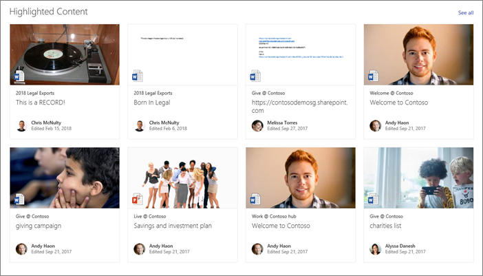
SharePoint Modern experience, in contrast, has a flat architecture. Each sub-site can be associated with multiple hub sites. This makes relevant information fully accessible to those who need it.
The hub site structure also means that users see SharePoint updates and information that is relevant to their memberships and permissions. This allows for a more tailored user experience.
And speaking of user experience, SharePoint Modern Experience also works better on mobile devices, whether accessed via a browser or mobile device
Navigation
On the point of making content more discoverable, SharePoint Modern experience significantly improves upon navigation and file discovery.
As part of Microsoft’s adoption of AI technology in its products, SharePoint Modern experience search function will try to predict the file or document that the user is looking for based on their previous work activity or role. It will also show results dictated by user permissions, meaning that only information that a user has access to will be shown.
Another advanced search feature available is metadata filtering. This is available in Classic experience but is integral to Modern experience.
This categorisation of items within SharePoint based on predefined criteria useful to your organisation (the type of document, the relevancy to the department, year of creation etc.) allows users to filter through SharePoint files by the metadata associated with each file.
Metadata is easy to add when a file is uploaded to SharePoint. This then helps users find the files with the particular attributes they need much faster than simply searching by item name. It is also highly useful when searching for more than one item ("all contracts created in 2012" or "images larger than 1080px" for example).
Permissions
Much like the change to system architecture, SharePoint Modern experience also does away with a purely hierarchical permission structure.
Instead, there are now three models for permissions based on site types:
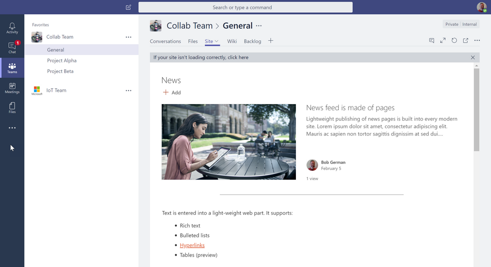
Team sites – Linked to Office 365 groups and Microsoft Teams, SharePoint team sites follow the permissions set out in these other Microsoft solutions. This helps create a uniform level of access across Microsoft applications and is therefore simpler to manage. Team sites may also be where files from these other Microsoft applications are stored.
Communication sites – Designed for sharing news or internal communication purposes, these sites are structured with a more traditional hierarchy, with SharePoint Owners, Members, and Visitors depending on the need to add, edit or publish content.
Hub sites – These sites provide access to sub-sites. An administrator will control access to the hub site and the associated sub-sites for users.
This three-pronged approach to permissions responds to the common uses for SharePoint and wider Office 365 usage trends.
Design & Branding
The final significant difference between Classic and Modern experience is perhaps the most obvious: the appearance.
SharePoint Classic experience once led the field in terms of what an intranet or document management solution could be. But over time, that look and feel have become dated. The available design themes are limited in terms of customisation options. Templates also aren’t designed for use on mobile devices, which is a significant drawback for on-the-go users.
With SharePoint Modern experience designed to be used as much for external-facing portals as internal document management solutions, the appearance has become far more attractive, more akin to a website in quality and responsiveness.
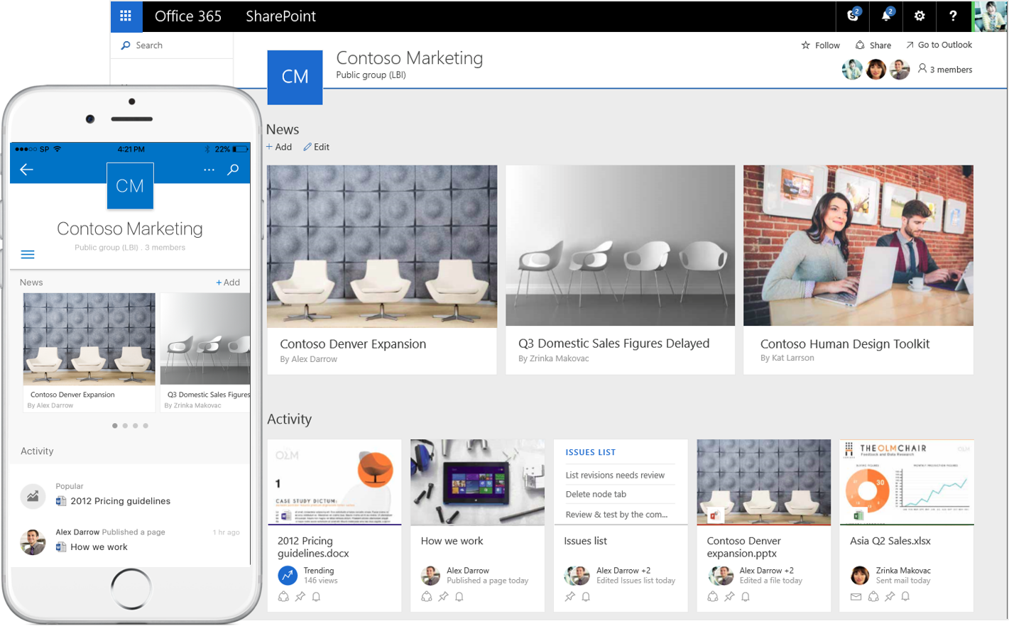
SharePoint Modern experience isn't a completely open book in terms of design. However, improvements to the overall appearance and additional branding options (logos, colours etc.) further promote the use of SharePoint as an intranet solution. It, therefore, makes SharePoint more engaging as an internal communication solution.
The transformation from Classic to Modern SharePoint
The move from SharePoint Classic experience to SharePoint Modern Experience is, unfortunately, not as straightforward as simply performing an upgrade.
You'll need a strategy to establish a new information hierarchy in the existing SharePoint site. Organisations will also want to take advantage of the extra design options available with new SharePoint themes. Some branding requires PowerShell to implement.
Should an organisation be planning a migration away from an older version of SharePoint or planning a revamp of an existing SharePoint instance, it should consider taking advantage of the features available with modern SharePoint.
To find out more about migrating to a more modern SharePoint experience for your organisation:


